FluentUI.Blazor v4.3
Overview
We’ve just released a new version 4.3 of Microsoft.FluentUI.AspNetCore.Components. This release corrects some bugs detected in recent days, but also adds a few new features.
- Wizard component: Wizards have a step-by-step user interface used to break down complex tasks into comprehensible elements.
- Progress and ProgressRing: New
StrokeandColorproperties. - Tab: New
Visibleproperty. - PageScript: New component for loading JS in SSR mode.
- Icons Explorer: Improved search on all sizes.
- Documentation: improved demo site navigation menu.
New features
Wizard component
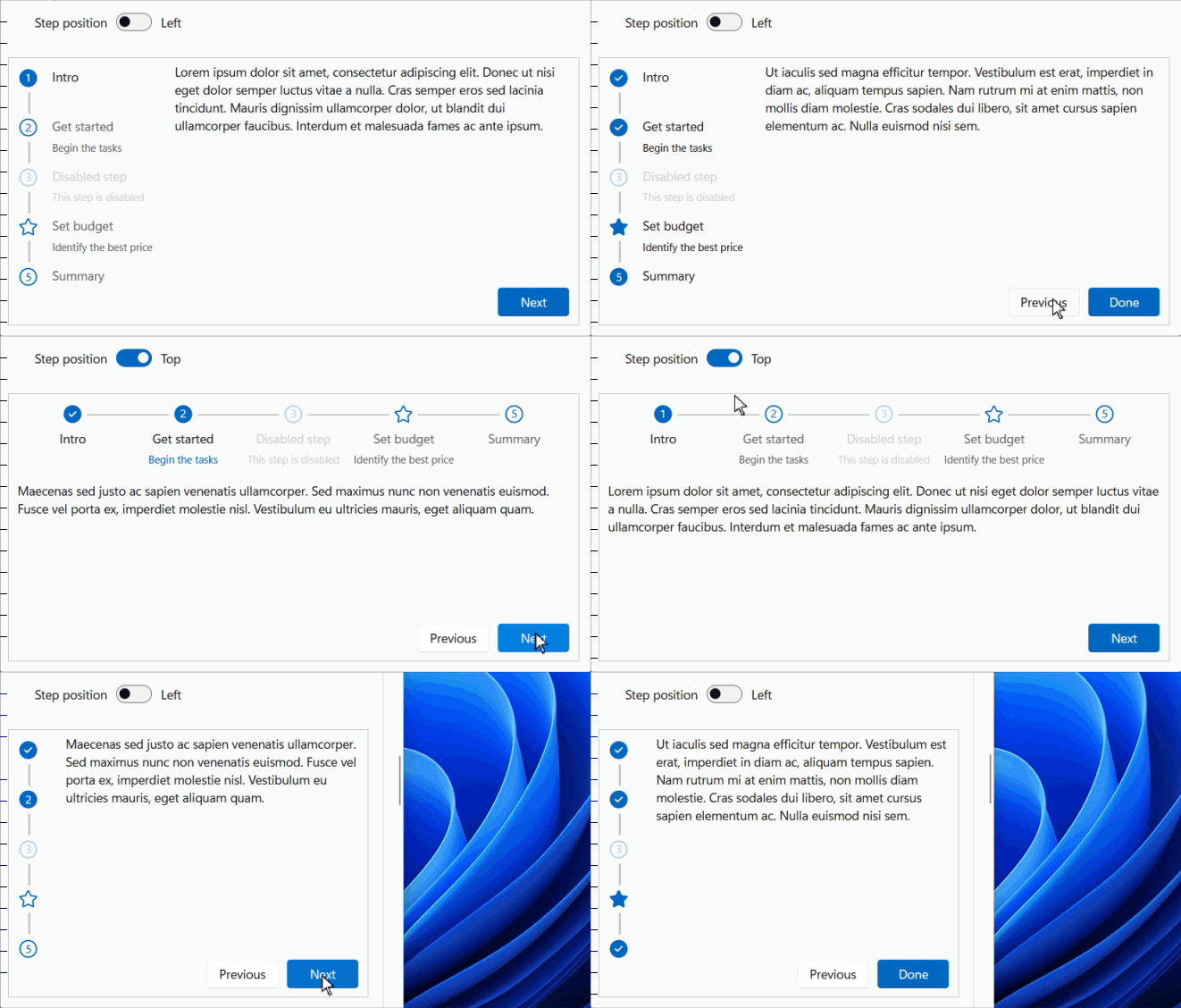
The Wizards have a step-by-step user interface used to break down complex tasks into comprehensible elements. The simplified presentation makes it easier for the reader to understand the scope of a given task and the actions required to complete it.
By default, steps are displayed on the left, but you can move them to the top of the component.
They take the form of circular bubbles, with a tick indicating whether or not they have been processed.
They are not numbered, but the DisplayStepNumber property lets you add this numbering.
These bubbles can also be customized via the IconPrevious, IconCurrent and IconNext properties.
The order of the steps must be defined when designing the wizard.
However, it is possible to enable or disable a step via the Disabled property.
By default, the contents of all steps are hidden and displayed when the user arrives at this step
(for display performance reasons). But the DeferredLoading property reverses this process and generates the content
of the active step only.
The Label and Summary properties display the name and a small summary of the step below or next to the bubble.
The StepTitleHiddenWhen property hides this title and summary when the screen width is reduced,
for example on mobile devices. By default, the value XsAndDown
is applied to hide this data on cell phones (< 600px).
All these areas (bubbles at left/top and navigation buttons at bottom) are fully customizable using the
the StepTemplate and ButtonTemplate properties (see the second example on this page).
You can customize button labels using the ButtonTemplate or by modifying the static properties
FluentWizard.LabelButtonPrevious / LabelButtonNext / LabelButtonDone.

Progress and ProgressRing - Stroke and Color
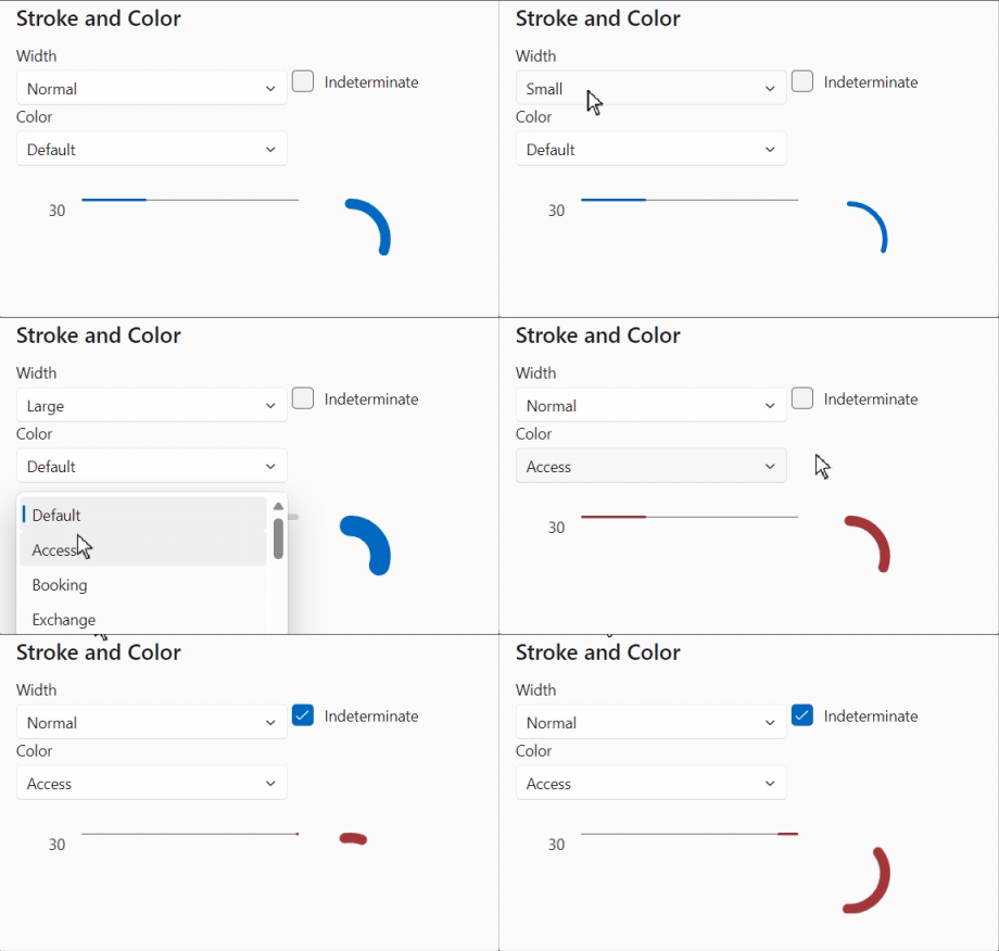
The two components FluentProgress and FluentProgressRing have two new attributes: Stroke and Color: (PR 1121)
- Stroke: The stroke width of the progress bar/ring:
Small,NormalorLarge. - Color: The color to be used for the progress bar/ring. If not set, the default theme color is used.

Tab - Visible
Added a Visible property to the FluentTab component to hide it if necessary (PR 1132).
Toast - Percentage
The current ProgressToast component displays a percentage sign below the progress bar, whether the progress state is determined or undetermined. This update displays the percentage sign only if the ProgressToastContent.Progress property is not null. (PR 1138).
Dialog - OnDialogClosing et OnDialogOpened
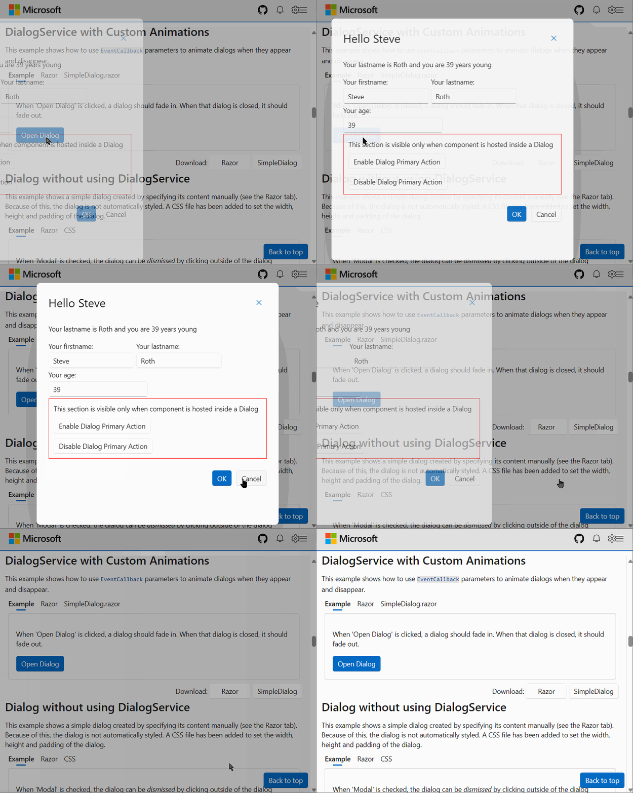
Sometimes, the developer may wish to interact with the way the dialog box opens or closes. For example, by adding a fade effect or moving the window. It is now possible to capture these two events and call/inject the code required for these effects.
You’ll find this example in our documentation.

PageScript
This Microsoft article explains how to load JavaScript (JS) into a Blazor web application with server-side static rendering (static SSR) and improved navigation.
Some applications depend on JS to perform initialization tasks specific to each page. When using Blazor’s enhanced navigation feature, which allows the user to avoid reloading the entire page, the page-specific JS may not be executed again as expected each time an enhanced page navigation occurs.
To avoid this problem, we’ve added the PageScript component, which you can use like this :
<PageScript Src="./Components/Pages/PageWithScript.razor.js" />
In the Blazor Web application, add the collocated JS file :
onLoadis called when the script is added to the page.onUpdateis called when the script still exists on the page after an enhanced update.onDisposeis called when the script is removed from the page after an enhanced update.
/* Components/Pages/PageWithScript.razor.js */

export function onLoad() {
  console.log('Loaded');
}

export function onUpdate() {
  console.log('Updated');
}

export function onDispose() {
  console.log('Disposed');
}
Icons Explorer - Search on all sizes
Updated the icon size list to include an “All” item. This allows the user to search for all icons. In this case, a small “Size” label is displayed at the top of the Icon.
![]()
Documentation Navigation
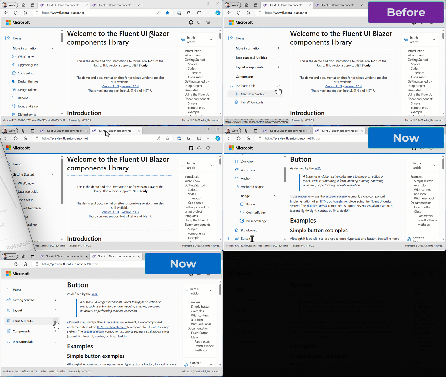
The navigation of the documentation / demo site has been updated to group components by category:
- Getting Started
- Layout
- Form and Inputs
- Components
- Incubation Lab

Additions and corrections
- 1116 Create FieldIdentifier when no ValueExpression set
- 1121 FluentProgress - Add Width, Stroke, Color and BackgroundColor attributes
- 1125 FluentProgress - Update Stroke enumeration
- 1132 Some FluentTab changes
- 1138 Fix: Do not render percent sign for indeterminate ProgressToast
- 1140 FluentIcon - Add Unit Tests
- 1141 Update initializersLoader.webview.js
- 1144 List components - Each item must be instantiated (cannot be null)
- 1146 FluentButton Loading - Fix button when style is applied
- 1149 ListComponentBase - maintain consistency between SelectedOption and Value
- 1155 Use GlobalState, use LocalizationDirection, less var’s
- 1156 FluentDesignTheme - Add OnLoaded event
- 1157 FluentDesignTheme - Check if LocalStorage is available
- 1158 Make NavGroup work with enhanced navigation and SSR
- 1161 Create separate ts file for PageScript Add SSR project from template for validation purposes (other projects githubbe added later)
- 1163 FluentDesignTheme - Storage color overload correction
- 1165 Finih implementation of NavMenu SSR support
- 1169 Fix: Matched FluentNavLink renders with background that does not have rounded corners
- 1172 FluentOverflow - Resize when a new element is included or excluded
- 1177 Docs: fix outdated w3.org link
- 1184 Docs: fix typo
- 1185 Fix: Collapse button doesn’t work correctly in Fluent Blazor Web App template
- 1189 fix Combobox z-index stack order issue
- 1191 Fix #1185: NavMenu Collapse button behavior in SRR only woks once
- 1194 Fix: FluentTextField inside FluentTabs, pressing Enter re-renders FluentTab’s content
- 1205 FluentButton submit does not work outside the EditForm
- 1211 FluentWizard - New component
- 1214 FluentSliderLabel - Update the sub-label MaxWidth style
- 1215 FluentTextField ignores DataList property
- 1223 DialogService - Add a fake instance of DialogEventArgs
- 1225 Fix #1205 FluentButton submit does not work outside the EditForm
- 1227 Fix: FluentTreeItem in that span that renders Text proprty is not conditional and adds unnecessary space when gap githubproperty is applied
- 1229 Add NavMenuWidth parameter to FluentMainLayout
- 1232 Several work items combined in a PR to not push to dev directly
- 1233 PageScript - Move script visibility inside the web component
- 1234 Templates - Fix spelling and use FluentValidationSummary
Templates
Numerous fixes have been implemented to ensure that pages and layouts get the right set of @rendermode attributes and NavMenu options depending on the interactivity choices made when creating an application.
Install the Visual Studio template using this link.
Preview NuGet Feed
If you want to keep up with what we’re building, we have a feed available that
hosts the packages for the core library that are built with each commit we make to the dev branch.
The address of the feed is https://pkgs.dev.azure.com/fluent-blazor/public/_packaging/previews/nuget/v3/index.json
This is not a stream to be used in production. It is directly linked to our development branch. It is therefore possible (probable) that certain Packages may cause problems for a few hours, the time it takes to detect and correct them.
Web sites
- Documentation: https://www.fluentui-blazor.net
- NuGet packages: https://aka.ms/fluent-blazor-libs
Feedback
If you find something out of the ordinary, let us know in the repo on GitHub, or Twitter / X.

