FluentUI.Blazor v4.5
Overview
We’ve just released a new version 4.5 of Microsoft.FluentUI.AspNetCore.Components. This release corrects some bugs detected in recent days, but also adds a few new features.
- New AppBar component.
- Demo site: Component search.
- Grid : Spacing and margins.
- Menu and Popover: Threshold parameters
- DataGrid: filtered property and visual indicator
- MenuButton: Overlay and appearances
- Card:
MinimalStyleparameter - Tooltip : Additional behavior
New features
AppBar component
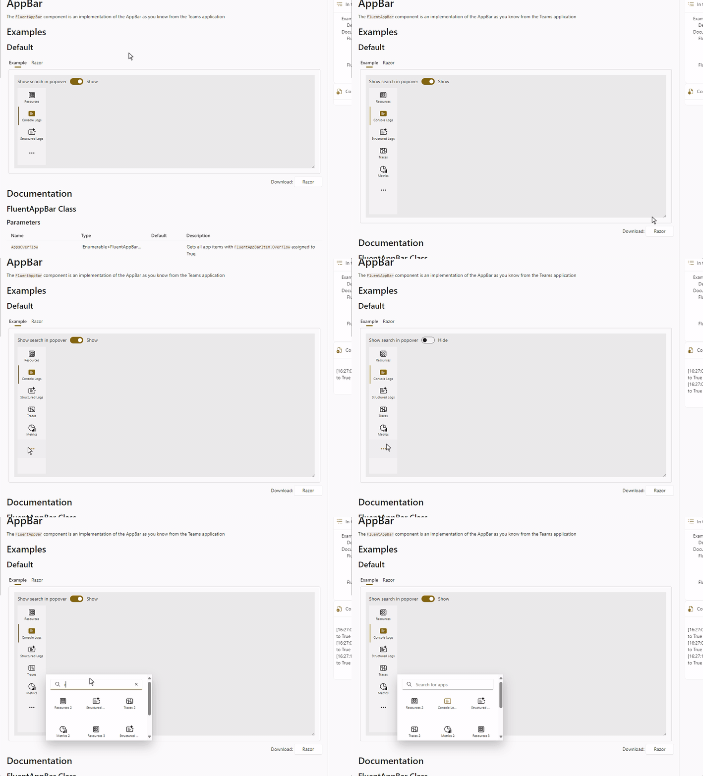
Based on work done by the .NET Aspire team (this library powers the .NET Aspire dashboard!) a new FluentAppBar component has been added.
The AppBar displays AppBarItems vertically, as in Teams and the (new) Outlook. It automatically displays ... at the bottom when the number of applications exceeds the available vertical space.
You can control whether this popover displays a search bar or not.
Demo site: Component search
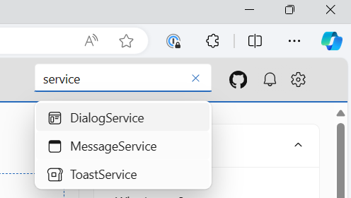
With almost 70 components in the library, it’s sometimes difficult to find the right documentation and example page. To help you navigate the site, we’ve added a component search function to the header (in desktop mode only).
Grid : Spacing and margins
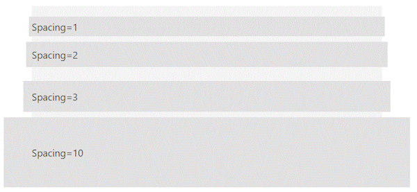
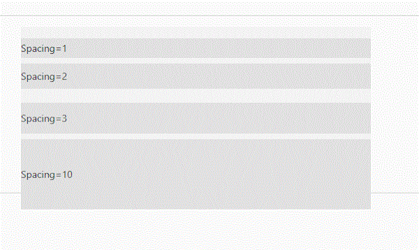
The FluentGrid became wider when the value of the Spacing parameter was increased. This has been corrected.
Before
After
Menu and Popover: Threshold parameters
The Menu and Popover components use the AnchoredRegion component internally to “attach” their rendering to another element.
The AnchoredRegion component exposes the VerticalThershold and HorizontalThreshold parameters to define the minimum space required to render the attachment to the preferred location.
This creates an automatic “reflow” in case there isn’t enough space available.
DataGrid: filtered property and visual indicator
When using multiple filters in a data grid, it was not easy to see whether a filter was applied to a specific column.
A FilterDismiss icon will now be displayed when a filter is applied to a column.

MenuButton: Overlay and appearances
A FluentOverlay has been added so that a click outside the menu closes it.
A ButtonAppearance parameter has been added to change the appearance of the button.
Examples have been added to the demo site to demonstrate this.

Card: MinimalStyle parameter
By default, the FluentCard component is a visual container and design system provider.
Cards are snapshots of content that are typically used in a group to present collections of related information.
So, by design, the FluentCard component includes all the styles required for a good representation of the other included components.
This adds a large number of styles such as justify-content; align-items; gap; width; and over 80 other CSS variables.
The amount of code generated can become quite substantial, especially if you use this component several times, for example in a large list.
To avoid this, you can now use the MinimalStyle parameter. This will remove all default styles from the FluentCard component and
apply a set of current styles through an isolated CSS. This allows you to use the FluentCard component
component as a simple container with only the styles needed to draw the box shadow (and a few other style rules required).
<FluentCard MinimalStyle="true">
    <p>Just some content in a card (with a button that does not do anything).</p>

    <FluentButton Appearance="Appearance.Accent">Hello</FluentButton>
    <p>No Width or Height has been specified.</p>
</FluentCard>
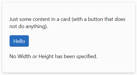
Code generated:
<div class="fluent-card-minimal-style">
  <p>Just some content in a card (with a button that does not do anything).</p>
  <fluent-button type="button" appearance="accent" class="accent">Hello</fluent-button>
  <p>No Width or Height has been specified.</p>
</div>
Without this parameter MinimalStyle
<div style="justify-content: start; align-items: start; gap: 10px; width: 100%; --neutral-layer-card-container: #f3f3f3; --neutral-layer-floating: #ffffff; --neutral-layer-1: #fbfbfb; --neutral-layer-2: #f3f3f3; --neutral-layer-3: #ebebeb; --neutral-layer-4: #e0e0e0; --fill-color: #fbfbfb; --accent-fill-rest: #286cbd; --accent-fill-hover: #2b75c7; --accent-fill-active: #3482d2; --accent-fill-focus: #286cbd; --accent-foreground-rest: #163d89; --accent-foreground-hover: #102f79; --accent-foreground-active: #2462b2; --accent-foreground-focus: #163d89; --accent-stroke-control-rest: linear-gradient(#3e7bc4 90%, #1c4b82 100%); --accent-stroke-control-hover: linear-gradient(#3e81cc 90%, #1f538d 100%); --accent-stroke-control-active: #468dd6; --accent-stroke-control-focus: linear-gradient(#3e7bc4 90%, #1c4b82 100%); --neutral-fill-rest: #ffffff; --neutral-fill-hover: #f7f7f7; --neutral-fill-active: #fbfbfb; --neutral-fill-focus: #fbfbfb; --neutral-fill-input-rest: #ffffff; --neutral-fill-input-hover: #f7f7f7; --neutral-fill-input-active: #fbfbfb; --neutral-fill-input-focus: #ffffff; --neutral-fill-input-alt-rest: #f3f3f3; --neutral-fill-input-alt-hover: #ebebeb; --neutral-fill-input-alt-active: #e0e0e0; --neutral-fill-input-alt-focus: #f3f3f3; --neutral-fill-layer-rest: #ffffff; --neutral-fill-layer-hover: #ffffff; --neutral-fill-layer-active: #ffffff; --neutral-fill-layer-alt-rest: #ffffff; --neutral-fill-secondary-rest: #efefef; --neutral-fill-secondary-hover: #f3f3f3; --neutral-fill-secondary-active: #f7f7f7; --neutral-fill-secondary-focus: #efefef; --neutral-fill-stealth-rest: #fbfbfb; --neutral-fill-stealth-hover: #efefef; --neutral-fill-stealth-active: #f3f3f3; --neutral-fill-stealth-focus: #fbfbfb; --neutral-fill-strong-rest: #717171; --neutral-fill-strong-hover: #4b4b4b; --neutral-fill-strong-active: #868686; --neutral-fill-strong-focus: #717171; --neutral-foreground-rest: #1a1a1a; --neutral-foreground-hover: #7a7a7a; --neutral-foreground-active: #a8a8a8; --neutral-foreground-focus: #1a1a1a; --neutral-foreground-hint: #717171; --neutral-stroke-rest: #d6d6d6; --neutral-stroke-hover: #c6c6c6; --neutral-stroke-active: #e0e0e0; --neutral-stroke-focus: #d6d6d6; --neutral-stroke-control-rest: linear-gradient(#efefef 90%, #d6d6d6 100%); --neutral-stroke-control-hover: linear-gradient(#e5e5e5 90%, #cecece 100%); --neutral-stroke-control-active: #e5e5e5; --neutral-stroke-control-focus: linear-gradient(#e5e5e5 90%, #cecece 100%); --neutral-stroke-divider-rest: #ebebeb; --neutral-stroke-input-rest: linear-gradient(#efefef calc(100% - 1px), #929292 calc(100% - 1px), #929292); --neutral-stroke-input-hover: linear-gradient(#e5e5e5 calc(100% - 1px), #8a8a8a calc(100% - 1px), #8a8a8a); --neutral-stroke-input-active: #e5e5e5; --neutral-stroke-input-focus: linear-gradient(#e5e5e5 calc(100% - 1px), #8a8a8a calc(100% - 1px), #8a8a8a); --neutral-stroke-layer-rest: #efefef; --neutral-stroke-layer-hover: #efefef; --neutral-stroke-layer-active: #efefef; --neutral-stroke-strong-rest: #636363; --neutral-stroke-strong-hover: #636363; --neutral-stroke-strong-active: #636363; --neutral-stroke-strong-focus: #636363; --neutral-fill-inverse-rest: #131313; --neutral-fill-inverse-hover: #272727; --neutral-fill-inverse-active: #000000; --neutral-fill-inverse-focus: #131313; --neutral-fill-stealth-rest-on-neutral-fill-layer-rest: #ffffff; --neutral-fill-stealth-hover-on-neutral-fill-layer-rest: #f3f3f3; --neutral-fill-stealth-active-on-neutral-fill-layer-rest: #f7f7f7; --input-placeholder-rest: #767676; --input-placeholder-hover: #717171; --input-filled-placeholder-rest: #6c6c6c; --input-filled-placeholder-hover: #6c6c6c; --clear-button-hover: #f3f3f3; --clear-button-active: #f7f7f7; --tree-item-expand-collapse-hover: #e0e0e0; --tree-item-expand-collapse-selected-hover: #e0e0e0;">
  <fluent-card style="--card-width: 300px; --card-height: 300px;">
    <p>Just some content in a card (with a button that does not do anything).</p>
    <fluent-button type="button" appearance="accent" class="accent">Hello</fluent-button>
    <p>No Width or Height has been specified.</p>
  </fluent-card>
  </div>
Tooltip : Additional behavior
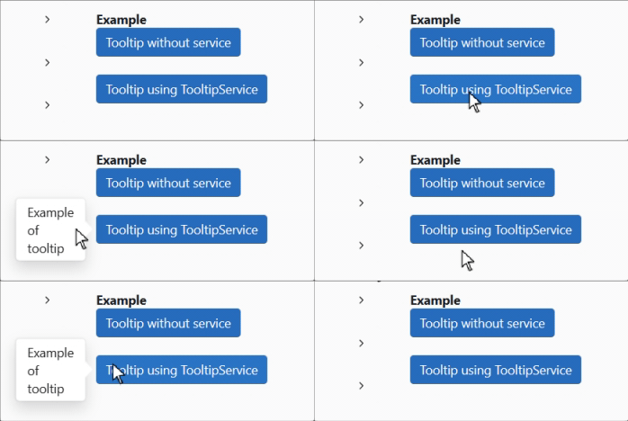
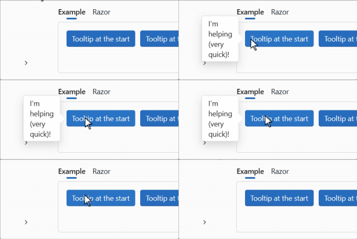
We’ve added a HideTooltipOnCursorLeave parameter to the FluentTooltip component.
You can now choose to use the default behavior :
or use a new behavior :
HideTooltipOnCursorLeave="false" (ou sans attribut)
HideTooltipOnCursorLeave="true"
Behavior can also be defined via the global configuration :
builder.Services.AddFluentUIComponents(configuration =>
{
    configuration.HideTooltipOnCursorLeave = true;
});
Icons
We have also updated the icon library with some twenty new illustrations.
Corrections diverses
The rest of the fixes and changes for this release are (again) quite a long list. We refer you to the What’s new page on the documentation site for a complete overview (including links to issues and change requests on GitHub).
Templates
We’ve updated templates to incorporate the latest fixes to components. We have also corrected a problem that appeared when external providers were used for authentication.
Install the Visual Studio template using this link.
Preview NuGet Feed
If you want to keep up with what we’re building, we have a feed available that
hosts the packages for the core library that are built with each commit we make to the dev branch.
The address of the feed is https://pkgs.dev.azure.com/fluent-blazor/public/_packaging/previews/nuget/v3/index.json
This is not a stream to be used in production. It is directly linked to our development branch. It is therefore possible (probable) that certain Packages may cause problems for a few hours, the time it takes to detect and correct them.
Web sites
- Documentation: https://www.fluentui-blazor.net
- NuGet packages: https://aka.ms/fluent-blazor-libs
Feedback
If you find something out of the ordinary, let us know in the repo on GitHub, or Twitter / X.

