

FluentUI.Blazor v4.8
Overview
Before we can all get out and enjoy our well-deserved summer vacation, we’re happy to bring you a new version of the Fluent UI Blazor library. In this release, we’ve added a few new features to existing components, fixed a few issues, made 1 (small) Breaking Change and worked hard to make the library better overall.
We’ve just released the new version 4.8 of Microsoft.FluentUI.AspNetCore.Components. This version fixes some bugs detected in recent days, but also adds a few new features.
- Breaking Change in the
Option<T>class. - FluentCalendar:
SelectionMode: Single, Range, Multiple. - FluentProfileMenu:
StartTemplateandEndTemplate. - FluentTreeView: Bindable
ItemsandLazyLoadItems. - Lists now inherit from
FluentInputBase. - FluentAutocomplete: dynamic height via
MaxAutoHeight. - FluentNavMenu on Mobile
- NuGet flow of Previews.
Breaking Change in the Option<T> class.
The Option<T> type is a utility class that can be used to define a list of options presented in a FluentSelect or other list component.
We have examples of how this works on the demo site.
Originally, the Text property of this class was generic (of type T?).
We’ve changed it in this version to string?, which we think is much more logical and suitable for HTML components.
The Value property remains unchanged at T?.
If you’re using this type, you’ll probably need to make a few minor adjustments to your code after updating to this version.
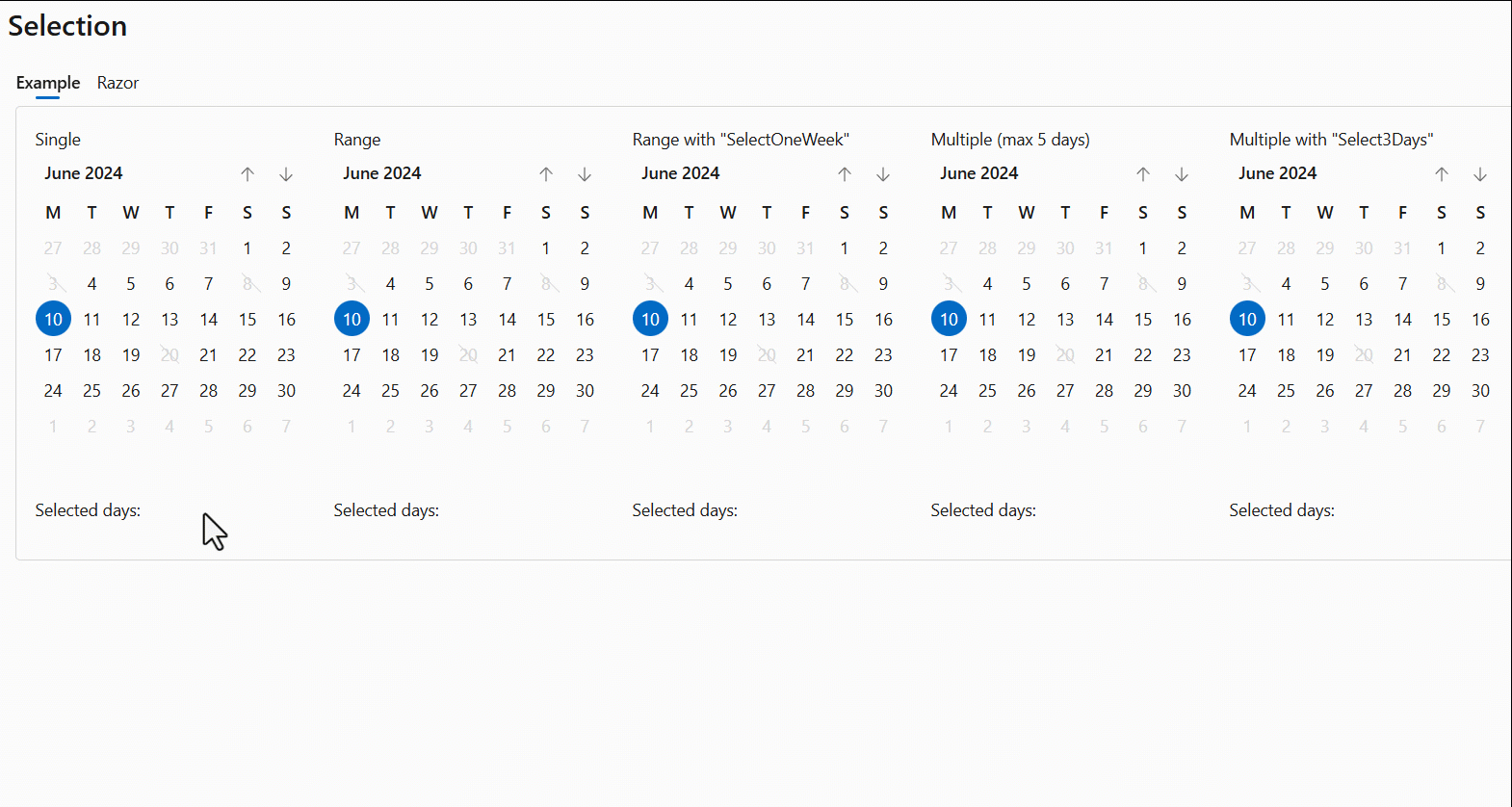
FluentCalendar - SelectionMode: Single, Range, Multiple.
The calendar now offers date range selection.
In addition to offering more date selection possibilities in the FluentCalendar component, we have now added date range selection capabilities.
At this moment, this functionality will only be available for the
FluentCalendarwithView=Days.
A new SelectedDates bindable property has been added to retrieve selected dates.
We’ve also added a SelectDatesHover method which returns a list of dates to be preselected on calendar hover.
These dates will then be selected when the user clicks on the selection.
This enables options such as selecting an entire week or a work week with a single click.
The @bind-SelectedDates:after command can be used to validate the content of selected dates, block or delete them if necessary, or even display an error message.
Example
<FluentCalendar @bind-SelectedDates="@SelectedRangeCustomized"
                SelectDatesHover="@SelectOneWeek"
                SelectMode="CalendarSelectMode.Range" />

<FluentCalendar @bind-SelectedDates="@SelectedDaysCustomized"
                SelectDatesHover="@Select3Days"
                SelectMode="CalendarSelectMode.Multiple" />
// Always select the full week, containing the "clicked" day.
IEnumerable<DateTime> SelectOneWeek(DateTime date)
{
    return new[] { date.StartOfWeek(), date.StartOfWeek().AddDays(6) };
}

// Always select 3 days, from the "clicked" day.
IEnumerable<DateTime> Select3Days(DateTime date)
{
    return Enumerable.Range(0, 3).Select(i => date.AddDays(i));
}
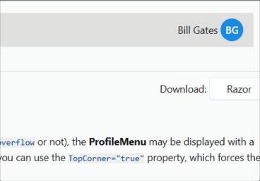
FluentProfileMenu - StartTemplate and EndTemplate
We’ve added the StartTemplate and EndTemplate parameters to allow custom code to appear before and after the avatar, while remaining inside the button.
The CSS variable --fluent-profile-menu-hover can be used to define the hover background color (overloadable).
<FluentProfileMenu Initials="BG" Style="--fluent-profile-menu-hover: var(--neutral-stroke-focus); padding: 4px;">
    <StartTemplate>
        Bill Gates
    </StartTemplate>
   ...
</FluentProfileMenu>
FluentTreeView - Bindable Items and LazyLoadItems.
Over the months, we’ve received many requests for the TreeView component to be able to display a large number of elements.
This capability has now been added.
-
Add an
Itemsattribute to link a list of elements and sub-elements (objects implementingITreeViewItem). TheTreeViewItemclass, included in the library, already implements this interface. You can use it or define your own.ITreeViewItem
- Id
stringGets or sets the unique identifier of the tree item. - Text
stringGets or sets the text of the tree item. - Items
IEnumerable<ITreeViewItem>?Gets or sets the sub-items of the tree item. - IconCollapsed
Icon?Gets or sets the Icon displayed at the start of tree item, when the node is collapsed. - IconExpanded
Icon?Gets or sets the Icon displayed at the start of tree item, when the node is expanded. - Disabled
boolWhen true, the control will be immutable by user interaction. - Expanded
boolGets or sets a value indicating whether the tree item is expanded. - OnExpandedAsync
Func<TreeViewItemExpandedEventArgs, Task>?Gets or sets the action to be performed when the tree item is expanded or collapsed
- Id
-
Add a
LazyLoadItemsattribute to generate HTML only when nodes are expanded. -
Added
ItemTemplateto allow full customization of each element. -
Added
SelectedItembindable property to manage the selectedITreeViewelement. -
Added
OnExpandedAsyncmethod to enable dynamic loading of sub-elements. For example, to display an “unlimited” tree view, as in this second example.
Example
<FluentTreeView Items="@Items" @bind-SelectedItem="@SelectedItem" LazyLoadItems="true">
    <ItemTemplate>
        @context.Text
        <span style="color: var(--accent-fill-rest); margin: 0 4px;">
            @(context.Items == null ? "" : $"[{context.Items.Count()}]")
        </span>
    </ItemTemplate>
</FluentTreeView>
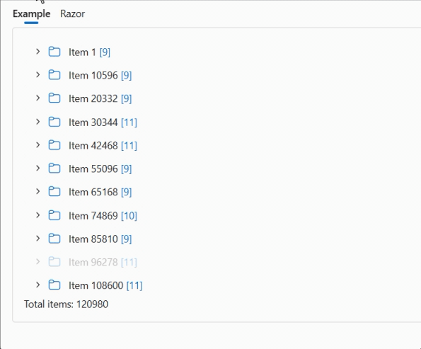
Example: Unlimited tree view
<FluentTreeView Items="@Items" @bind-SelectedItem="@SelectedItem" />
private ITreeViewItem? SelectedItem;
private IEnumerable<ITreeViewItem>? Items = new List<ITreeViewItem>();

protected override void OnInitialized() => Items = GetItems();

private Task OnExpandedAsync(TreeViewItemExpandedEventArgs e)
{
    if (e.Expanded)
    {
        e.CurrentItem.Items = GetItems();
    }
    else
    {
        // Remove sub-items and add a "Fake" item to simulate the [+]
        e.CurrentItem.Items = TreeViewItem.LoadingTreeViewItems;
    }

    return Task.CompletedTask;
}

private IEnumerable<ITreeViewItem> GetItems()
{
    var nbItems = Random.Shared.Next(3, 9);

    return Enumerable.Range(1, nbItems).Select(i => new TreeViewItem()
        {
            Text = $"Item {Random.Shared.Next(1, 9999)}",
            OnExpandedAsync = OnExpandedAsync,
            Items = TreeViewItem.LoadingTreeViewItems, // "Fake" sub-item to simulate the [+]
        }).ToArray();
}
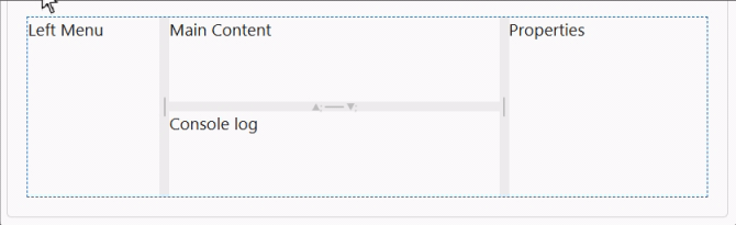
FluentMultiSplitter
The FluentMultiSplitter divides the page into several sections, allowing the user to control the layout.
You can include as many panes as you like in a container. By default, panes are resizable,
but the Resizable property can be used to block this functionality.
The initial size is expressed as a percentage or in pixels, and has a minimum and maximum value.
A panel can be completely reduced in size by setting the Collapsible property to True.
Why have we created this new component when
FluentSplitteralready exists?We want to generalize this component by facilitating the use of several (>2) panels per container. We’ve also used CSS variables to simplify color and size customization.
Example:
<FluentMultiSplitter Height="150px">
    <FluentMultiSplitterPane Size="20%" Min="50px" Max="70%">
        Left Menu
    </FluentMultiSplitterPane>
    <FluentMultiSplitterPane Size="50%">
        <FluentMultiSplitter Orientation="Orientation.Vertical">
            <FluentMultiSplitterPane Collapsible="true">
                Main Content
            </FluentMultiSplitterPane>
            <FluentMultiSplitterPane Collapsible="true">
                Console log
            </FluentMultiSplitterPane>
        </FluentMultiSplitter>
    </FluentMultiSplitterPane>
    <FluentMultiSplitterPane Size="30%">
        Properties
    </FluentMultiSplitterPane>
</FluentMultiSplitter>
The lists now inherit from FluentInputBase.
List components (FluentAutoComplete, FluentCombobox, FluentListbox and FluentSelect) now inherit from FluentInputBase.
This allows components to participate in form validation and be marked as invalid.
note: The
FluentAutocompletecomponent has not yet been migrated.
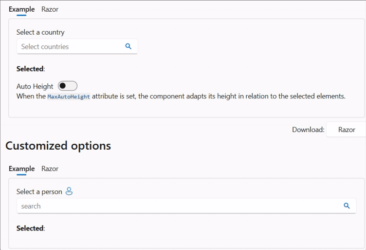
FluentAutocomplete - MaxAutoHeight.
We’ve added a new MaxAutoHeight parameter to the Autocomplete component.
Using this parameter, you can make the component use an automatic height with a maximum size.
If no value is set, the current behavior (a single line with horizontal scrolling) is used.
FluentNavMenu - on Mobile
Now, FluentNavMenu works better with mobile devices.
The demo site and sites created from templates now work in the same way when a FluentNavMenu is displayed in a mobile view.
By clicking on the expand or collapse button of a FluentNavGroup or on the group itself, the group will simply be expanded or collapsed
(if no reference has been defined for the group).
Clicking on a FluentNavLink with a defined reference will navigate to that link and then close the menu.
With these changes, we achieve consistent behavior.
NuGet Previews feed
By popular demand, we have recreated a preview package feed.
Every time a commit is pushed to the dev development branch, the Core main library is published
on a special NuGet repository.
dotnet nuget add source --name dotnet8 https://pkgs.dev.azure.com/dnceng/public/_packaging/dotnet8/nuget/v3/index.json
This will add the stream to your existing nuget.config file. See How configure NuGet behavior? to find out more.
Alternatively, if you use Visual Studio, you can Install and manage packages in Visual Studio
and add the feed https://pkgs.dev.azure.com/dnceng/public/_packaging/dotnet8/nuget/v3/index.json.
⚠️ This NuGet is a preliminary version and is not intended for production use. It is intended to be used to test the latest features and bug fixes.
If you only want the latest final version of FluentUI-Blazor, the packages are on NuGet.org.
As the feed address shows, our packages are now created in the .NET Core Engineering environment (dnceng). A big step forward for the security, stability and longevity of the library!
Corrections diverses
The rest of the fixes and changes for this release are (again) quite a long list. We refer you to the What’s new page on the documentation site or to the GitHub release page for a complete overview (including links to issues and change requests on GitHub).
Web sites
- Documentation: https://www.fluentui-blazor.net
- Preview: https://preview.fluentui-blazor.net
- NuGet packages .NET8: https://aka.ms/blazor/fluentui/libs
Feedback
If you find something out of the ordinary, let us know in the repo on GitHub, or Twitter / X.