FluentUI.Blazor v4.4
Overview
We’ve just released a new version 4.4 of Microsoft.FluentUI.AspNetCore.Components. This release corrects some bugs detected over the last few days, but also adds a few new features.
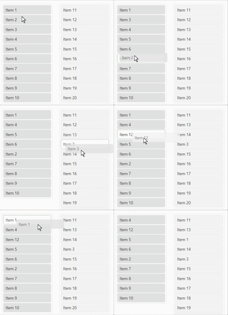
- New Sortable List. Allows you to reorganize items in a list (or from one list to another) by drag-and-drop.
- New KeyCode. Sometimes Blazor doesn’t retrieve all the KeyDown information it receives from JavaScript. This small component retrieves this data.
- New (experimental) MultiSplitter. This component divides a panel into several sections, allowing the user to control the layout.
- DataGrid Loading. We’ve added
LoadingandLoadingContentparameters to the FluentDataGrid data grid. - Lists components. Lists have been modified to handle the Items property in the same way as
FluentOptions.
New features
Sortable List
An implementation of the [SortableJS] library (https://sortablejs.github.io/Sortable/) for Blazor FluentUI. This component allows you to reorder items within a list (or between lists) using drag-and-drop. It is based on Burke Holland’s article and code (reused with his permission).
The demo site contains full details on how to use the component in your own projects (we don’t include the SortableJS script in the library) and the parameters that can be used for configuration. We’ve made a few changes to the original properties to give it a more Blazor-like appearance.
The component has no default implementation for handling update events. Examples are of course provided. If you don’t handle any events, no sorting or moving will occur, as Blazor must make changes to the underlying data structures in order to redisplay the list.

KeyCode
In certain circumstances, Blazor does not retrieve all the KeyDown information it receives from JavaScript. FluentKeyCode is a small component that retrieves this data, in a similar way to the JavaScript KeyCode library.
The FluentKeyCode component extends the properties of the OnKeyDown event by adding a FluentKeyCodeEventArgs object which contains the following arguments:
- Location is the keyboard used (Standard, NumPad, Mobile, …).
- KeyCode is the numeric value of the key pressed.
- KeyCode is the
Enumvalue corresponding to KeyCode. - CtrlKey, ShiftKey, AltKey, MetaKey are True when the
Ctrl,Shit,Altormetakey is pressed, in addition to another key. - ShiftKey is True when the
Ctrlkey is pressed, in addition to another key.
⚠️ Some properties come from data marked Deprecated, but are still supported by all browsers. This component will be adapted accordingly, once the new properties are available.
It is possible to ignore or include only certain key combinations, to optimize the communication process between JavaScript and Blazor. It is also possible to stop propagation and prevent the default action of the current event.
xml
```

Multi Splitter
The FluentMultiSplitter component divides the panel into several sections, allowing the user to control the layout.
You can include as many panes as you like in a container. By default, panes are resizable, but the the Resizable property can be used to block this functionality. The initial size is expressed as a percentage or in pixels, and has a minimum and maximum value. A panel can be completely reduced in size by setting the Collapsible property to True.
This component is currently in “Experimental” status.
See documentation on this page.

Why have we created this new component when FluentSplitter already exists? We want to generalize this component by facilitating the use of several (>2) panels per container. We’ve also used CSS variables to simplify color and size customization. Let us know what you think :-)
DataGrid component update
We’ve added the Loading and LoadingContent parameters to the FluentDataGrid data grid.
By default, when Loading is set to true, the loading content will be a progress ring with the text “Loading…”.
You can replace this content with your own using the LoadingContent parameter.
Updating list components
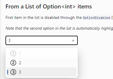
The list components (AutoComplete, Checkbox, Listbox and Select) have been modified so that it doesn’t matter whether the options are specified by the Items parameter or by manually specified FluentOptions.
In a single selection situation, we will always find and process the selected option.

The AutoComplete component has undergone an accessibility upgrade.
You can now use the keyboard to navigate through list items, and select an item via Enter.
Overall, the component now works much better with screen-reading software.
Custom size for FluentIcon
If you wish to add an icon to FluentIcon with a custom size (not included in the standard IconSize), you can now use the value IconSize.Custom.
Miscellaneous corrections
The rest of the corrections and changes for this release are (once again) quite a long list. We refer you to the [What’s new] page (https://www.fluentui-blazor.net/WhatsNew#v4.4) on the documentation site for a complete overview (including links to issues and change requests on GitHub).
Templates
We’ve updated templates to incorporate the latest fixes to components. We have also corrected a problem that appeared when external providers were used for authentication.
Install the Visual Studio template using this link.
Preview NuGet Feed
If you want to keep up with what we’re building, we have a feed available that
hosts the packages for the core library that are built with each commit we make to the dev branch.
The address of the feed is https://pkgs.dev.azure.com/fluent-blazor/public/_packaging/previews/nuget/v3/index.json
This is not a stream to be used in production. It is directly linked to our development branch. It is therefore possible (probable) that certain Packages may cause problems for a few hours, the time it takes to detect and correct them.
Web sites
- Documentation: https://www.fluentui-blazor.net
- NuGet packages: https://aka.ms/fluent-blazor-libs
Feedback
If you find something out of the ordinary, let us know in the repo on GitHub, or Twitter / X.

